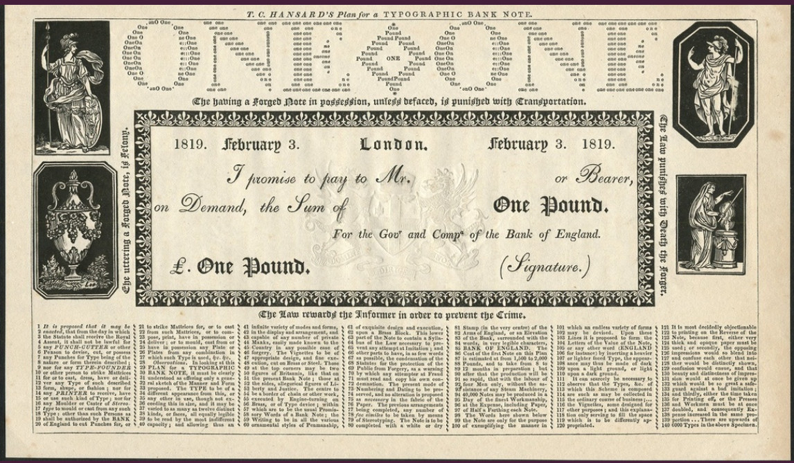
In 1819, as the Bank of England struggled against counterfeiters, T.C. Hansard proposed a note that combined such a variety of typefaces that a lone forger couldn’t hope to duplicate it — the faces descended all the way to Diamond, the smallest available, and the bottom of each note would be filled with 140 lines of fine print containing hidden “private marks,” such as individual letters printed in italic or small capitals.
To create even the authentic version would have required a team of 20 people, from punchcutters to engine makers, to fulfill the typographical and other design flourishes. Hansard estimated that producing the first note would have cost as much as £2,000 and taken up to a year, “but after that the production will be so rapid, that with the labour of four Men only, without the assistance of any Steam Machinery, 40,000 Notes may be produced in a Day of the finest Workmanship, at the Expense, including Paper, of Half a Farthing each Note.”
In the end the proposal wasn’t adopted — small notes were withdrawn from circulation in 1821, and the search was dropped.
(Virginia Hewitt, “Beware of Imitations: The Campaign for a New Bank of England Note, 1797-1821,” Numismatic Chronicle 158 [1998], 197-222.)

