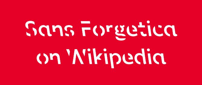
Designed by a multidisciplinary team at Melbourne’s RMIT University, Sans Forgetica is a typeface that’s intended to reduce legibility, on the theory that the “desirable difficulty” of reading it will result in deeper processing and, ultimately, better retention.
The back-slanted, incomplete letters form a “simple puzzle” for the reader, RMIT lecturer Stephen Banham told the Washington Post last October. “It should be difficult to read but not too difficult. In demanding this additional act, memory is more likely to be triggered.”
The team say they’ve tested the font on university students and found that “Sans Forgetica broke just enough design principles without becoming too illegible and aided memory retention.” You can try it yourself — they’re offering a free download and a Chrome extension.