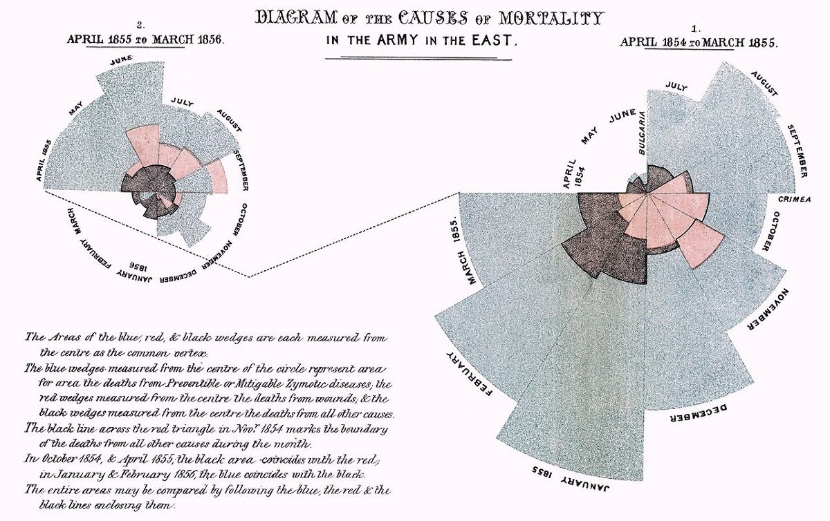
Florence Nightingale created this innovative diagram to track the causes of mortality in the Crimean War. Her description:
The Areas of the blue, red, & black wedges are each measured from the centre as the common vertex.
The blue wedges measured from the centre of the circle represent area for area the deaths from Preventable or Mitigable Zymotic diseases, the red wedges measured from the centre the deaths from wounds, & the black wedges measured from the centre the deaths from all other causes.
The black line across the red triangle in Nov. 1854 marks the boundary of the deaths from all other causes during the month.
In October 1854, & April 1855, the black area coincides with the red, in January & February 1856, the blue coincides with the black.
The entire areas may be compared by following the blue, the red, & the black lines enclosing them.
The diagram on the right corresponds to the first 12 months of the war; the one on the left shows the second 12 months. The difference reflects the dramatic effectiveness of a sanitary commission in reducing disease.
Nightingale found that presenting information graphically made it more accessible to Members of Parliament and civil servants, who might not otherwise read statistical reports. In 1859 she was elected the first female member of the Royal Statistical Society.