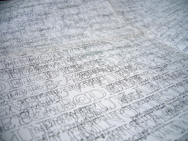
For Fuse 18, the experimental typographic publication that appeared in February 2001, type designer Matthew Carter reflected on the grand lettering that appears on public buildings: It’s meant to last for eternity, but inevitably it’s effaced by weather, by other inscriptions, and by the graffiti of vandals.
So, wryly, he offered DeFace, which speeds up the process.
“This typeface,” he wrote, “contains a set of inscriptional capitals that are self-vandalizing: each letter has graffiti associated with it that deface neighboring letters. Depending on the text, the graffiti can vandalize both the underlying capitals and other graffiti to make a palimpsest of marks that are individually legible but obscure in combination.”